Wednesday, December 12, 2012

Some More Gestures


Some more gesture sketches from the Schoolism course. The course is almst over now, I'm just waiting for my final review. These sketches are from different lessons, all done with ink on paper.

The last two drawings were based on pictures from the old Gesture Drawing Tool. That site is really great, I always like to wonder who the people on these pictures are, and if they know they're on that site. 

Friday, December 7, 2012

Access All Areas


This little storyboard is part of my final homework assignment from the schoolism gesture course. We had to use the models poses as inspiration for a little storyboard. The poses of this chubby rock fan were all based on the model, who in reality is a slim Asian yoga lady. It was a lot of fun, just like the rest of the course. I'm a bit sad that it's almost over now. (I'm still waiting for my final review)

We were instructed to choose a character to use for this exercise and I had this guy lying around from an early abandoned concept for my graduation project, from back in 2011.

Digital storyboard, drawn in Sketchbook Pro.

Tuesday, November 20, 2012

Extrapolation


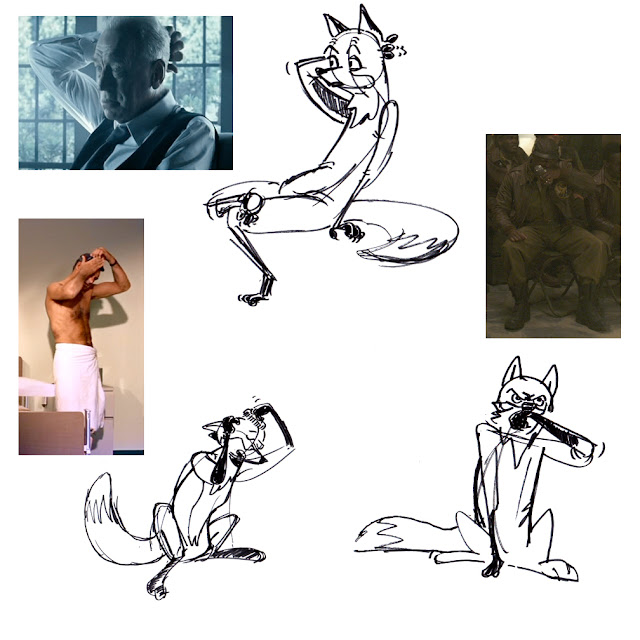
Some examples of this week's assignment from the Schoolism gesture course I'm doing. This week's lesson was Extrapolation, explained by Alex Woo as: "The process of seeing beyond the surface of what's in front of you."

In my previous post you saw some studies of foxes that were part of the previous homework assignment. This lesson I had to use my chosen animal, the fox, and focus on drawing the model as if he or she was a fox. The big challenge is to keep the original gesture in the drawing without loosing the spirit of a fox, you do not want your drawing to feel like a guy dressed up as a fox.

These are just some of the examples of what I did for this assignment. As you can see I have been using film stills as an inspiration.

Ink on paper.

Sunday, November 11, 2012

Red Fox Studies


Recent homework from the Gesture course on Schoolism. Apart from our usual model drawing assignments, this time we also had to research an animal of choice. We are to study the anatomy of one animal so that we are able to draw it without using reference.

As you might have guessed, I chose a Red Fox for this assignment. This is only a selection of the many sketches I did, both on loose sheets and in my sketchbook. One of the many great things about this course it how much it makes me sketch. I have started a new sketchbook early october -one of those thick old-fashioned a4-sized hardbacks-  and it is already filled halfway through! Mostly with gesture sketches and cafĂ© drawings done for the gesture course. 

All of these are 100% traditional: ink, (Pentell Pocket Brushpen, Pentell Sign, Pitt Brush Pen) and color pencil on paper.
 

Sunday, November 4, 2012

Katow-jo

Watched Anchorman the other night, did this sketch of the bear at the end. (That Schoolism course is ruining me, I can't watch a film without pausing it to sketch interesting poses anymore!)

Brown Pitt brushpen on paper, digital tones with Photoshop.

Tuesday, October 30, 2012

Nosferatu Sketches


Since Halloween is almost upon us I thought it'd be nice to share these sketches of Nosferatu I did earlier this week. He's a fun character to draw. I watched the orginal 1922 film earlier this week, it is in the public domain and full versions can be found on youtube and vimeo. 

I did the sketches above before watching the film and as you can see I gave him normal vampire teeth, instead of the silly evil-bunny teeth he has in the film. The sketches below I did while watching the final scene: death by rooster!
 

Friday, October 19, 2012

Gesture Drawing: Pushing the Pose

A little more work from my gesture class over on Schoolism. This week's lesson was silhouette. Part of our weekly assignment is that we have to use photos, film-stills or illustrations to find examples of whatever subject we are treating that week. 

I prefer to work from photos because with illustrations the poses are already stylized by the artist, which makes finding the line of action, shape or silhouette easier and, as a result of this, makes it harder to learn from. Searching for pictures with strong silhouettes I discovered Rita Hayworth (after reading that she would have turned 95 last Wednesday), she really had the greatest poses.  

The picture above is a publicity photo from the Orson Welles' film The Lady from Shanghai. The image beneath is my first attempt. I pushed her right arm (screen left) away from her body to make the pose read better. I also made her lower body bend away a little. 
If there is anything I have learned from my first two feedback sessions by Professor Louis Gonzales, it is that you should always try to push the pose further. ("push it till it breaks") It is better to push a pose a bit to far and tone it down a little, than to realize that you could have pushed it further.

A great help is Photoshop's transform option. Once you have established in which direction the pose is moving you can skew the picture in that direction. Here I felt that Rita Hayworth was moving to the left:


It's amazing how far you can actualy skew a picture without going too far. As you can see by the doors this picture is now leaning way to the left, still the pose doesn't feel that pushed. After this little trick I did two more versions of the silhouette from this pose. 

I quite like the way the final version turned out, although I'm not sure if it's the best translation of the original pose. In the picture I feel that Rita Hayworth is entering the room and is about to move towards the left side of the screen. My final sketch has her more standing still, and maybe slighty moving foward. But it is funny to see how extreme you can push the human body without it feeling weird: If you look at that final sketch and see how far her head is away from where her feet are standing you realize that this is an uncomfortable angle, but as a drawing it feels pretty good I think.    


Friday, October 12, 2012

James Bond - iPad Sketch

About ten years ago I was a huge fan of the Dutch comic artist Hanco Kolk. At the time I really wished I could make beautiful brush-inked line drawings like him. Since then I have moved on to other influences but I still love his work very much.

Yesterday I was playing around with this Paper app on the new Ipad3 of one of my friends, when I discovered that one of the pen tools in this app gives a line very much like Hanco Kolk's smooth brushstrokes. I did quite a few sketches, this one is my favourite.

Please don't look at it for too long, though. The paper app makes it pretty hard to erase mistakes, especially since it doens't have a layer option. there are quite afew things I wish I'd be able to erase (I'm especially displeased with the arms) but this would also erase the rest of the sketch.

Oh, and in case you didn't notice this is supposed to be Daniel Craig's James Bond, I'm really looking foward to Skyfall!

iPad sketch in Paper with a Wacom Bamboo Stylus.       

Wednesday, October 10, 2012

More Gesture Practice


Applying the theory from the Schoolism gesture course. By first sketching in the shape of the figure it is easier to keep the right volume. (In this case I used a green highlighter because it was there.) These two sketches were based on photos from a magazine.

Tuesday, October 2, 2012

Gesture Course


I'm currently enrolled in a 12 week gesture drawing course, over on Schoolism. The class is thaught by Alex Woo and Louis Gonzales, who are story artists at Pixar where they also teach in-house gesture classes.

These are some examples from my second asignment. I'm thrilled that after just two lessons I already see some improvement in my poses. These are all 30 seconds poses, ink on paper.  

Monday, September 24, 2012

One More Tony

Just when I accepted that Tony Soprano is impossible to draw I doodled this. One of those happy little accidents I guess...

Wednesday, September 19, 2012

Woke Up This Morning

If you follow me on Twitter you might have hear me say that I'm currently rewatching The Sopranos. I'm now half way season three, and I'm happy to see Ralphie again: Joe Pantoliano plays the greatest scumbags.

Ever since I started watching the Sopranos for the first time, I have done sketches of Tony. But he is just impossible to draw. Maybe it's because he is so inseparable from James Gandolfini, the actor that portrays him.

Anyway, these are two of my latest attempts, I like 'em as drawings but they are not Tony. In the end I got frustrated and tried Jimmy Altieri, a character from the first season. He's that guy at the bottom. 

Ink on paper, digital colors.

Wednesday, September 12, 2012

Pardner

The other day I doodled a cowboy. Threw in some color today and pasted him on this pic of Texas to round it up.

Only after I colored him did I recognize that red bandana /blue shirt combination: Dr. Alan Grant!

Monday, September 10, 2012

Vacation Sketches - Part 3.


This is the last batch of sketches from my vacation in Italy, last month. All of these were done along the shores of Lake como. We stayed in the lovely town of Menaggio. The last sketch of this post gives you an impression of the view we had from our balcony. 

Ink on paper, digital tones with Photoshop.


Friday, August 31, 2012

Vacation Sketches - Part 2.


Some more sketches from my recent trip to Italy. Just like the previous post all of these were done on the same day. After a week at Lake Garda we moved to Lake Como for the second week of our vacation. We took a train to Milano, and from there another train to Como. (We had to go first class since second class was sold out. At Como this posh, old American couple asked us if we were busted for not having first class tickets! (I guess they were surprised by our big backpacks; they must have thought only boring old farts travel first class.)

At Como we took a boat to Menaggio, where we stayed. It was a long trip, almost three hours. I didn't mind, I love Lake Como and I really enjoyed slowly cruising the lake. We found a good, quiet spot by the window so I took out my sketchbook. I was sketching the entire trip. Although the boat was real slow, I still had to draw real fast: the view was constantly changing. These are some of the sketches I did. I quite like the sketch of the man in his rowboat, above. It is actually a very small sketch, only 3 by 2 cm.  

I'll post some more of these sketches soon!


Monday, August 27, 2012

Vacation Sketches - Part 1.


Hey there! Long time no posts. So far this year has been a bit of a struggle. But things are looking up, and I have just returned from a nice vacation in Italy where I did quite a bit of sketching. This is just a first batch of sketches, I'll post some more soon. 

It was funny, I brought three sketchbooks and like a 100 pens, pencils and even waterpaint. I ended up using only the sketchbook with the worst paper and four of my most plain pens. I had fun just sketching away, though. The sketchbook -a normal sized, plain paper moleskine, with a soft cover- fitted perfectly in the side pocket of my shorts together with the pens: so it was easy to take 'em everywhere.

We spend a week at Lake Garda and then another week at Lake Como. These drawings are all from the first week at Lake Garda, I actually believe I did all of them on the same day.

All of these were done with a Copic Multiliner and a Papermate Flair, I threw in some tones with photoshop too.  I'll post more when I get around to scanning the rest of the book. Because the paper is rather thin though, I can't make good scans of all of my sketches. Still there should still be quite a few left that are good enough to post.